TSP’s all-time, all-argument starting best, and worst, sports logos of all time. All images courtesy of sportslogos.net
In no particular order we present,
The Best
Yomiuri Giants - Japanese Baseball
Note the way that the “Giant” aspect is perfectly put into perspective by the size of bats he’s holding and the city behind him? Read further and you’ll see what happens when designers don’t bother to do this and suddenly you get basketballs big enough to crush Rio De Janerio.
Washington Senators - Baseball
It’s a ye olde founding father senator winding up to hurl a fastball. Genius.
Vancouver Ravens - Lacrosse
Probably the hottest Raven ever invented.
Toledo Mud Hens - Baseball
Never before has any member of the chicken family shown so much concentration.
 “>
“>
Temple Owls
If you’re saddled with designing a logo for a pissweak animal like an Owl, at least make it look like it’s going to kill somebody.
Portland Sea Dogs - Baseball
It’s a dopey looking seal, but this has definately got something going for it.
Plymouth Whalers - Ice Hockey
The greatest blowhole blastoff EVER. Look at the concentration on his face - it’s the little things that make it.

Hartford Whalers - NHL
Speaking of Whalers, it’s the greatest stylised letter logo ever. If there’s ever been a professional sports team that needs to come back you’re looking at it.

Vancouver Canucks - Ice Hockey (1970)
Pong on an Atari 2600. Genius.
Oakland/Los Angeles/Oakland Raiders - NFL
Simple, classic and with a hint of real menace. He’s going to cut your head off and shag your dog.

New Orleans Voodoo - Arena Football League
Super spooky. But also classy!
Nashville Kats - Arena Football League
Sleazy cats don’t always make for the best logos, but when it looks like the Fonz and will probably sell you a key of coke in the carpark afterwards you’ve got to give some respect.
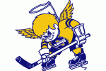
Minnesota Fighting Saints - Ice Hockey
An evil child. Will throw things at your car while you’re driving down the freeway.
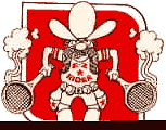
Houston EZ-Rider - Tennis
Smokin’ rackets? That’s cool. EZ Rider? That’s just stupid. Lucky we’re not ranking sports team names - being named here would certainly show up that long defunct franchise.

Hawaii Islands - Arena Football League
There aren’t enough logos featuring somebody giving the big “don’t argue” with the left hand.

Hamilton Bulldogs - American Hockey League
The standard by which all sporting bulldogs should be judged. Infinately better than the shitful Footscray version.

Grand Rapids Rampage - Arena Football
By the time you see the rhino it will already have killed you. More likely to happen in Africa than Grand Rapids, but they’re not huge on Arena Football there apparently.
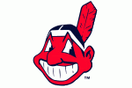
Cleveland Indians - Baseball
The happiest man in sports! No idea why, they never win anything.
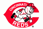
Cincinatti Reds - Baseball
Sure, they may have also given us the worst logo ever (keep reading..) but what redemption - his head is a freaking baseball ferchristsake. This guy would get more birds than the Captain in the Flight Centre ad.
Hiroshima Toyo Carp - Japanese Baseball
Look at the sheer determination on that kid’s face! Every organisation which starts with “C” should be stealing this for motivational purposes.
Monmouth University Hawks
He wants you to come to his car. He wants to do things to you.
Toronto Phantoms - Arena Football
A truly terrifying spectre. Sadly the only thing that actually died was the team.

Youngstown University Penguins
That penguin is saying, “yes, I look stupid but mock me and I will DESTROY you”. A formidable opponent against anyone other than a club wielding Polish sailor.
The Worst
Lewiston MAINEiacs - Ice Hockey
So, you’re commissioned to come up with a logo for the worst team name ever. Do you, a) chuck a sickie, or b) create something resembling an inbred simpleton.
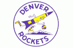
Denver Rockets - ABA (1971)
If the rocket is that big, and the mountains are that small - how big does that make the basketball? Frightening.
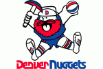
Denver Nuggets - ABA (1975)
What is it with Denver basketball sides? First the giant rocket, and now the guy who looks like Peter Russell Clarke having just sat on something substantial.
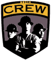
Columbus Crew - MLS
Looks more like a union meeting than a sports logo.

Los Angeles Sharks - World Hockey Association - 1973
Ladies and gentlemen, the porkiest shark of all time. So slow in the water that instead of running in terror when it turns up, people swim around and taunt it instead.

Milwaukee Admirals - American Hockey League
Drawn by a 12-year-old much?
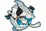
Cleveland Barons - American Hockey League
A tuxedo clad shark with a monocle playing hockey should tick all the boxes for comedy, yet somehow this just falls short.
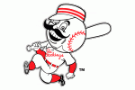
Cincinatti Reds - Baseball (1960)
First he stole bases, then he stole 12-year-olds from their beds. Horrifying.

Chicago Fire - World Football League (1974)
Dude! Your head is totally on fire!
Las Vegas 51’s - Baseball
I fucking hate aliens.
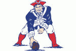
New England Patriots - NFL (70’s-1992)
Fact, if they actually had somebody who looked like one of the Village People playing Centre in the Superbowl they would have gone 19-0.
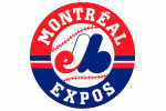
Montreal Expos - Baseball (RIP)
I once saw an explanation of this logo on a website. When a logo requires an explanation there’s something seriously wrong.
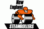
New England Steamrollers - Arena Football (1988)
It really looks as if he’s humping a car.
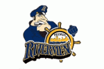
Peoria Rivermen - Baseball
Gay sea captains are a marketing dream
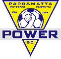
Parramatta Power - NSL
Why are they arm wrestling over a football?

Club Marconi - NSL
An italo-themed boomerang and a radi o transmission tower? Did Marconi invent the throwing stick as well?

Portland Storm - World Football League - 1974
What the fuck is that thing? No wonder they only lasted a year.
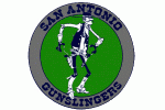
San Antonio Gunslingers - USFL - 1984
The pansiest looking gunslinger in history. More likely to shoot himself in the kneecap than to successfully hit you in the event of an actual duel.
St. John’s Fog Devils - Ice Hockey
See, I might be a sick person but he seems to be performing unspeakable acts. I don’t want to see that in my sports logos.

Atlanta Apollos - National American Soccer League
In English please?

Carolina Cougars - ABA (1971)
Note to all sports marketing executives - there’s a reason why only one team has ever had a sinister animal rubbing a ball as if he’s trying to read your fortune.

Canton Invaders - Indoor Soccer
HE HAS EMERGED FROM A GIANT SOCCER BALL TO KILL YOUR FAMILY
Tulsa Roughnecks - NASL
Everyone knows that giant Americans with wrenches in their hands are only ever seen near soccer if they’re chasing somebody down the street trying to hit them for playing it.
Boston Lobsters - Tennis
First things first when the hell does anyone have a league for tennis. Secondly I’ve been studying the serving action of the Lobster for hours (or minutes) and I still can’t work out what the hell is going on.
Arkansas Travellers - Baseball
Never include a marketing slogan in your logo.
The Rest
Chattanooga Lookouts - Baseball
Well it does what it says, but don’t you think it’s just a little bit sinister? Like it’s looking at you through your bathroom window or something.
Fukuoka Hawks - Japanese Baseball
Hey, the bird is flipping me off!

Memphis Southmen - USFL
I hate the logo but it’s got a sort of cool Godzilla destroys Tokyo vibe to it.
I’m unsure about this one. I’m not at all terrified by their crazy duck, but he does have a look of determination on his face which says “I’m going to peck your nuts off”.
University of Missouri - Kansas City
This is precisely the sort of “fuck you” fighting Kangaroo logo that North Melbourne should adopt (sans pissy skivvy if possible) rather than the ill-defined thing they’ve got at the moment which may as well be a chicken.

No comments:
Post a Comment